Text as a Visual Element in Contemporary Embellishment
New to Luneville embroidery?
Start with the chain stitch—my free visual guide shows you exactly how
Text on clothing is often associated with print: slogans, commercial logos, or repeated motifs on fabric. But as soon as text becomes part of an embellished surface its behaviour changes. It stops being flat information and starts acting as a visual component that can shape proportion, rhythm, and tone. Designers often use text not because they want people to “read” it, but because they want to work with the cultural meaning, visual form, or emotional charge behind the words.
Below are several examples where text is treated as material, structure, or message in different ways. The aim is to show how meaning and construction interact when letters become embellishment.
Oscar de la Renta — Spring 2018 Ready-to-Wear
A brand name used three different ways
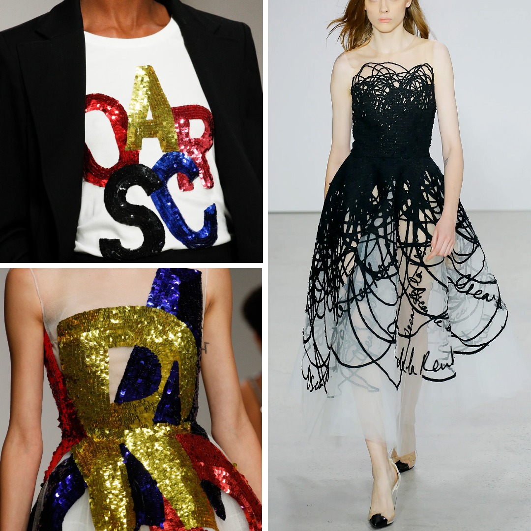
This collection shows how a simple, straightforward source — Oscar de la Renta’s own name — can be transformed through scale and technique.
The tulle dress with oversized sequinned letters
Large “OSCAR” letters are cut in bright sequins and wrapped around the body. At this size, each letter behaves less like part of a word and more like a graphic block. The colour contrasts (red, blue, gold, black) and the diagonal placement create movement across the dress. The name of the house becomes a compositional tool.
The T-shirt and suit with a compressed layout
The same letters appear again, but in a tighter formation across a white T-shirt. Sequins on jersey always create a crisp texture against matte tailoring, and here that contrast pushes the text to the foreground. The meaning is still “Oscar,” but the effect is sharper and more contained.
The black scribble dress
Here the word is stretched into looping handwriting that spreads across the bodice and skirt. It still references the house name, but the technique — continuous embroidered lines on tulle — turns the letters into something closer to layered drawing.
Across these looks, one name produces three different visual roles: bold shapes, centred statement, and chaotic line-work. These variations show how text, even a brand name, can be rethought when approached as embellishment rather than print.
Dolce & Gabbana — Spring 1992 Ready-to-Wear
Text as direct, playful pop language
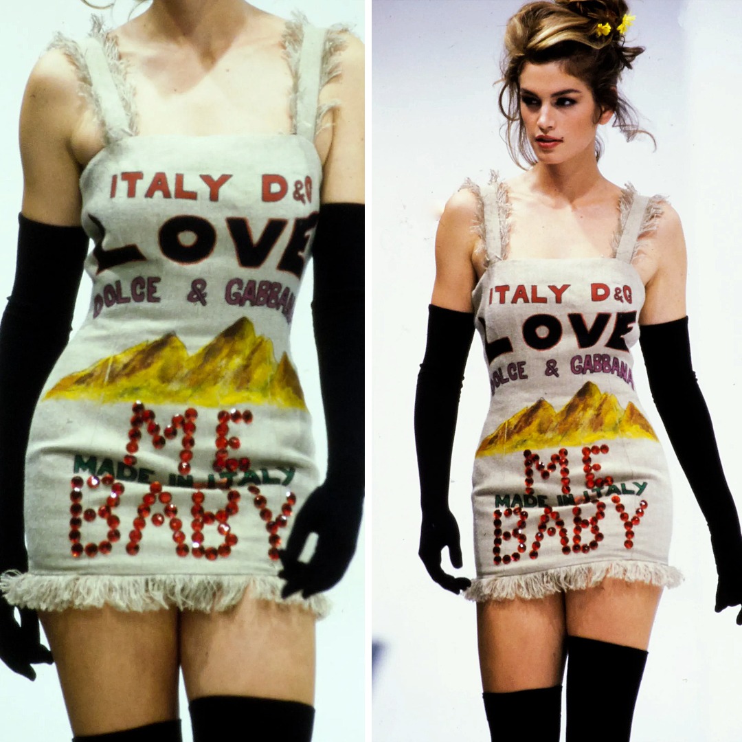
In Spring 1992, Dolce & Gabbana used text in a way that felt deliberately bold and unfiltered. One of the dresses features the word “LOVE” printed across the chest, accompanied by illustrated scenery and additional text applied using glued crystals that spell out “ME BABY.” The mix of print and sparkling embellishment gives the surface the look of a poster or signboard — bright, straightforward, and unapologetically theatrical.
This approach fits the brand’s early vocabulary: cinematic references, Southern-heritage storytelling, and deliberately provocative messaging. The text is not meant to blend into the garment; it is the focal point. It pushes the piece toward pop iconography rather than subtle ornament.
This example matters because it shows an early, confident use of text as spectacle — where language is used for its cultural tone and immediacy, not for refinement.
Christian Dior — Fall 2020 Couture (“Eyre”)
A quotation used as a visual and intellectual reference
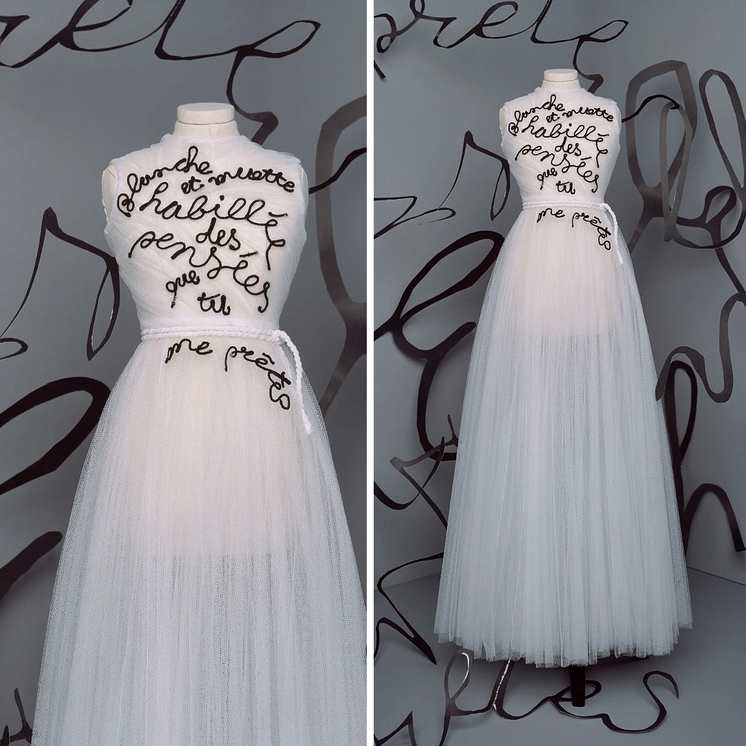
The “Eyre” gown is a clear example of text used for its cultural weight rather than decoration. The dress is embroidered with a quotation from Belgian surrealist Marcel Mariën:
« Blanche et muette habillée des pensées que tu me prêtes. »
The text is applied in black rat-tail cord on white draped tulle. Rat-tail cord produces an even, continuous line that keeps its shape on soft fabric. It gives the quotation the look of handwriting transferred directly onto the dress without stylisation or flourish.
The significance lies in the choice of text: Chiuri frequently incorporates references to authors, poets, and women artists, and here she brings a surrealist text into couture form. The gown carries language from an existing artwork, turning the dress into a space for citation rather than decoration. The words are not commentary; they are part of the conceptual structure of the look.
Dior Men — Spring 2025 Menswear
A personal phrase with cultural reference
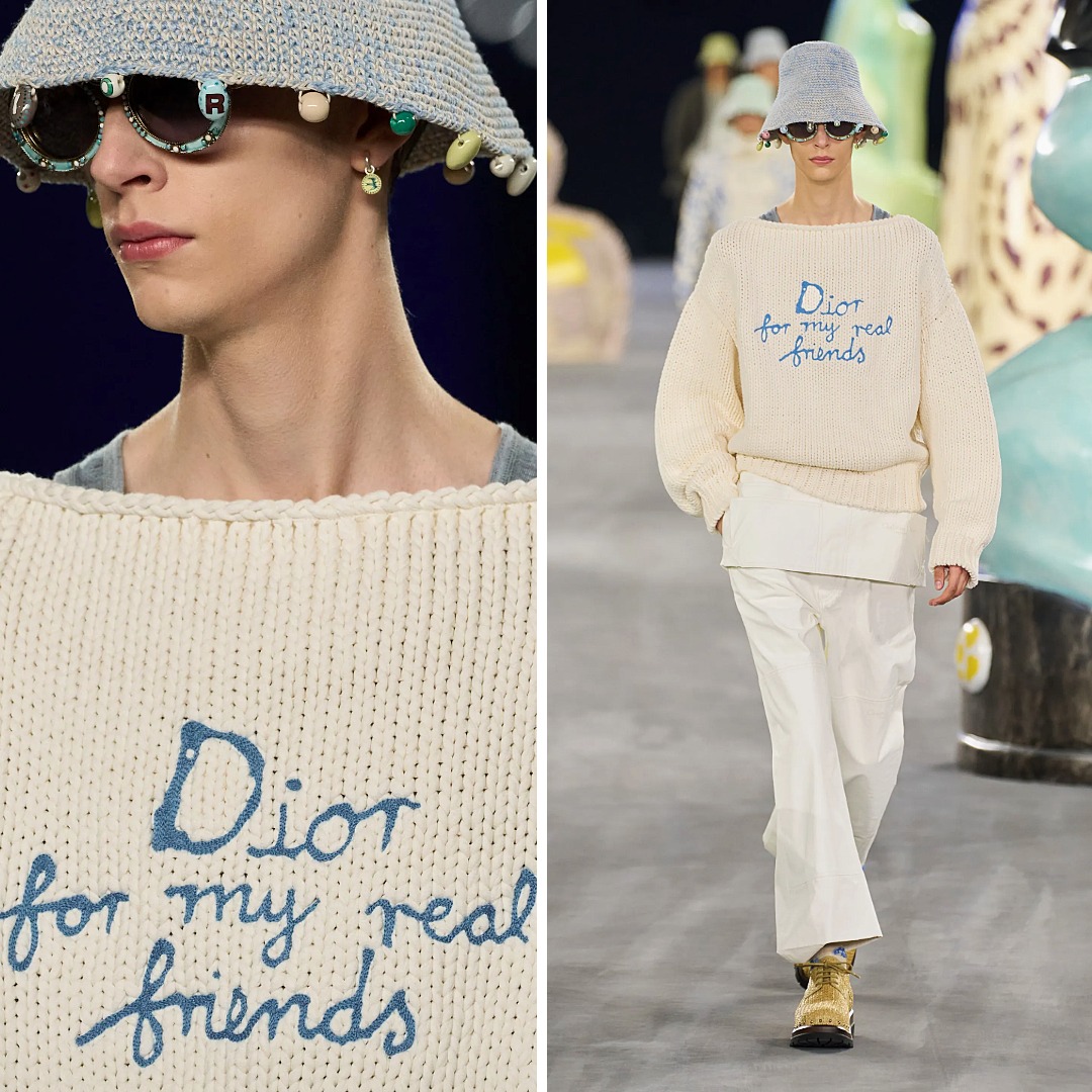
Kim Jones used text sparingly in this collection, but one knit jumper carries the line:
“Dior for my real friends.”
The phrase is taken from a plate created by the ceramicist Hylton Nel and also echoes a well-known cultural formulation (“For my real friends…”). Jones’s version is integrated into the knit in soft, slanted lettering. The material keeps the message informal and almost private; it doesn’t read like a slogan.
Here text works as a personal aside within a large house. It sits low on the torso, understated but visible — an internal thought placed on a garment, delivered through a craft-heavy medium. This is text used not to solicit attention, but to set a tone.
Antonio Marras — Fall 2020 Ready-to-Wear
Two approaches: raw emotion and constructed message
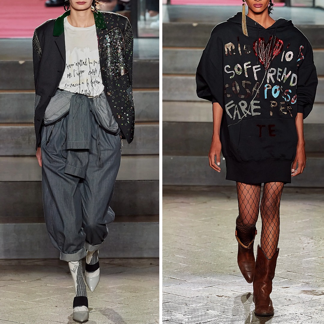
Marras’s collection often draws on personal and historical references, and your two chosen looks show contrasting uses of text.
Stitched handwriting with loose ends
The letters on the shirt are sewn in narrow stitched lines, with thread ends intentionally left long. This is not polished embroidery; it’s closer to a handwritten note reproduced with fibre. The loose ends make the text feel immediate and unfiltered — almost like a thought caught mid-sentence.
Collaged letters built from fabric and sequins
The hoodie uses a different method: letters assembled from small pieces of fabric, appliqué, sequins, and drawn elements. Each letter is an object. The message is constructed rather than written.
These two approaches show how construction changes tone: one is intimate and fragile, the other theatrical and layered.
Yohji Yamamoto — Fall 2024 Menswear
Text placed as part of the garment’s architecture
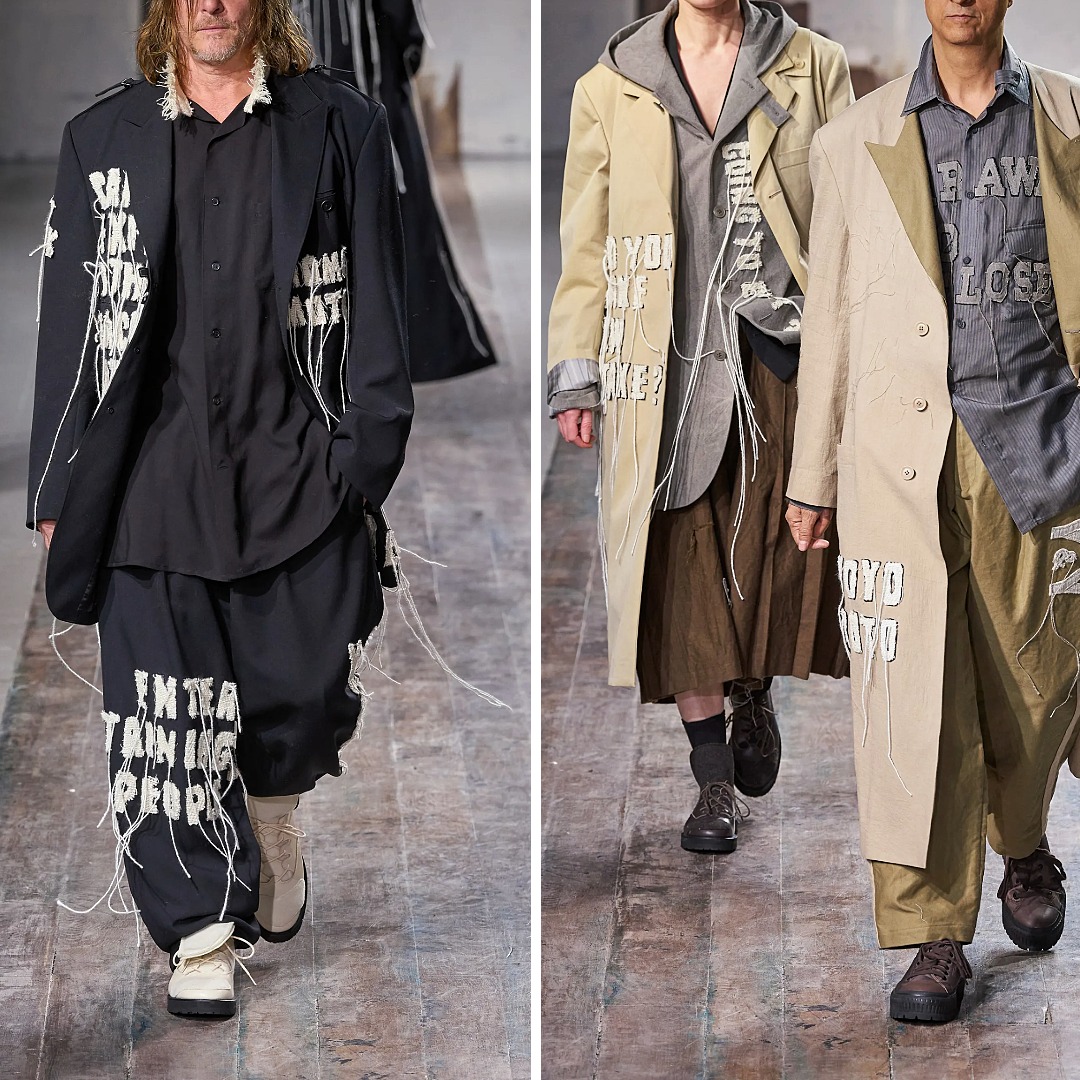
Yamamoto’s use of text is consistent with his long-standing interest in fragmented writing and existential commentary. In Fall 2024, the words appear vertically along coats, made from a mix of:
stitched lines
rough appliqué
painted or inked marks
The vertical placement aligns with the length of his coats and works almost like an added seam or structural panel. Instead of reading as a horizontal message, the text follows the garment’s natural direction. It becomes part of the anatomy of the piece: a narrow column of language that deepens the garment’s visual rhythm.
Balmain — Resort 2025
“Amour” as a full-surface, couture-level declaration
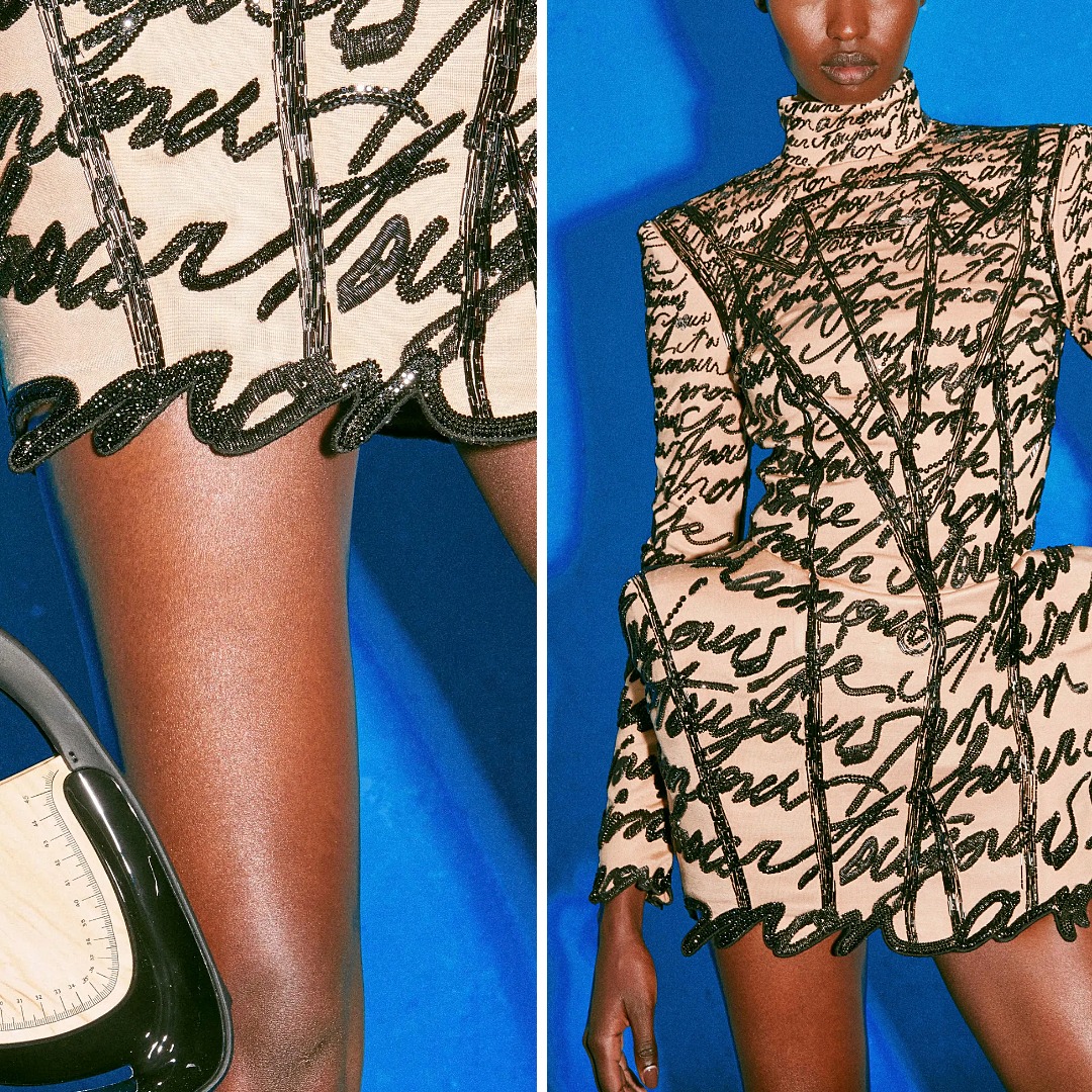
Balmain’s Resort 2025 dress uses text in the most expansive way among your examples. The word “Amour” repeats across the entire silhouette, worked in:
seed beads
bugle beads
voluminous sequins
French wire / bullion
This combination creates a raised, textured handwriting that covers the garment in black on a nude base. Because the materials have different densities and reflectivity, the repeated word becomes more than text — it becomes a pattern and a three-dimensional surface.
Rousteing has worked with handwriting for years, and here he pushes it into full emotional maximalism. “Amour” is not subtle; it’s deliberate and overwhelming, matching the sculptural cut of the dress. This is text used as atmosphere and identity at once.
Text in my own practice: the XO project and monogram
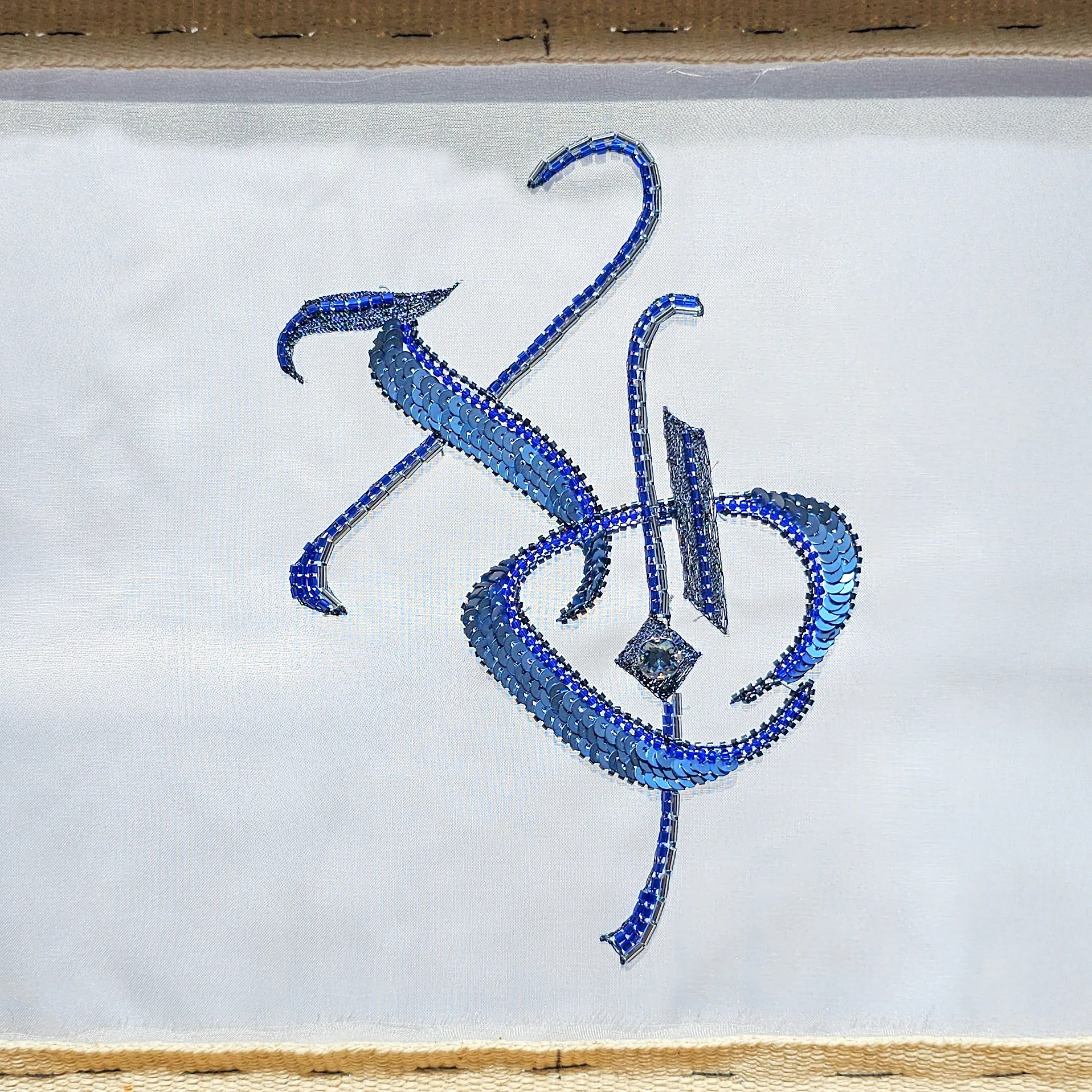
In my Introduction to Luneville Embroidery course, I use a gothic “XO” motif as the main composition. “XO” — hugs and kisses — is a small gesture of encouragement, but the gothic letterforms also provide a solid structure for beginners: clear verticals, diagonals, enclosed shapes, and natural places to add beads, sequins, or cord.
The project is not about practising random strokes; it’s about understanding how text can anchor an embellished composition. Once students finish the “XO,” they move on to a bonus monogram design, which allows them to personalise their work and apply the same logic to their own initials.
Both pieces underline the same idea: text isn’t just something you read — it’s something you can build with.
Across the collections, text appears in very different roles:
a brand name treated as a graphic motif
direct pop language used as spectacle
a quotation carrying artistic and literary context
a personal phrase delivered quietly
raw handwriting with emotional edges
assembled letters acting as objects
vertical fragments that support the silhouette
a repeated word used as an all-over pattern
The variety shows that text in embellishment is not limited to slogans or branding. Its meaning depends on the designer’s intention and the technique used to build it. Even the simplest text — a name, a word, a pair of letters — can become a visual element if handled thoughtfully.
This is why I use lettering in my teaching. The “XO” composition and the follow-up monogram design both show how text can organise a surface, carry meaning, and give structure to decoration. It’s a practical way to learn embellishment, but also a reminder that letters are versatile tools — capable of being emotional, graphic, personal, or architectural, depending on how you choose to work with them.
For readers who want to see these references side by side, I’ve created a Pinterest board that includes all the looks from this article and additional examples of contemporary text-based embellishment.
Written By
Ksenia Semirova
MA Textiles
An experienced hand embroidery and textile artist based in Hove, UK. Professionally practicing since 2021, mastering various techniques.
Also a fine artist and visual researcher, exhibiting her works across the UK and internationally.
Join my mailing list
Get the latest and greatest updates to your inbox!