Rodarte’s Fall 2025 Palette Isn’t Black — It’s Moonlight
New to Luneville embroidery?
Start with the chain stitch—my free visual guide shows you exactly how
This fall, as expected, designers leaned into bold, saturated colours. Vogue’s official Fall 2025 Trend Report specifically highlighted neons, vivid jewel tones, and rich gothic blacks as the season’s defining shades. Yet Rodarte chose a distinctly different route. Their Fall 2025 collection was built around what designers Kate and Laura Mulleavy described simply as “seeing colour through moonlight.” Rather than abstract or vague, this poetic description translated into a clearly defined and intentionally muted colour palette, setting the brand apart from prevailing seasonal trends.
A Practical Look at Rodarte’s “Moonlight” Palette
So, practically speaking, what does a moonlight-inspired palette mean in textile and colour terms?
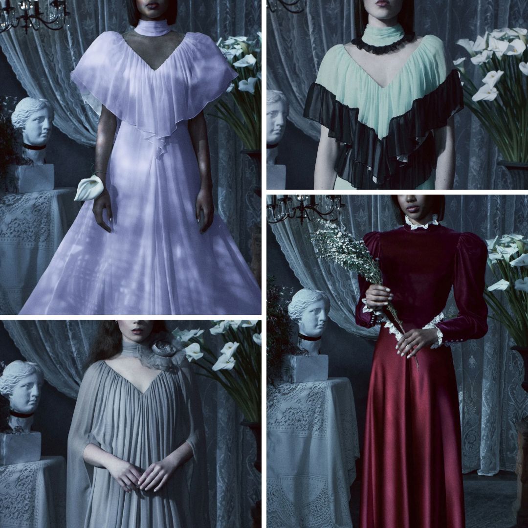
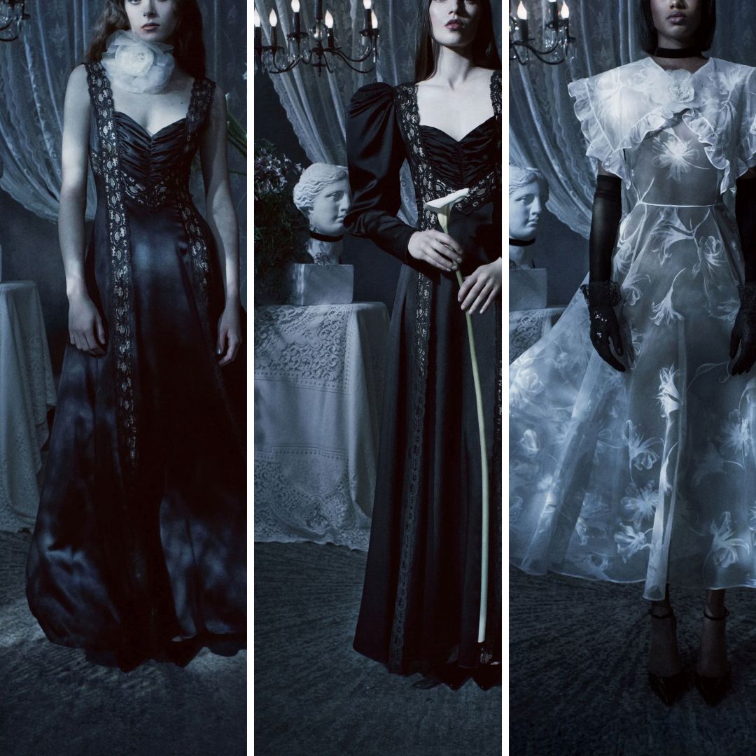
Rodarte’s approach was noticeably restrained: instead of vivid hues, the designers chose intentionally softened versions of traditionally stronger colours. For instance, instead of vivid lavender or violet, the designers used a dusty lavender-grey — clearly distinguishable yet significantly softened. Crimson appeared not as an intense, saturated red, but as deep, muted burgundy, more reminiscent of dried petals than fresh blooms. Even their use of green came as subdued mint, a far cry from brighter or fresher greens typically popular on fall runways. Black—often a stark, intense colour — appeared as rich velvet or textured fabrics, rather than solid or flat shades, giving visual depth without heaviness.
By consciously muting these colours, the Mulleavy sisters effectively redirected attention to fabric texture and surface embellishment, creating garments that appeared quiet at first glance but revealed significant detail upon closer inspection.
Texture and Materiality: The Real Stars of the Show
In collections where designers rely heavily on vibrant colours, surface details often become secondary. Rodarte, however, inverted this conventional approach. Because the colours were carefully muted, texture and craftsmanship naturally became the primary visual focus.
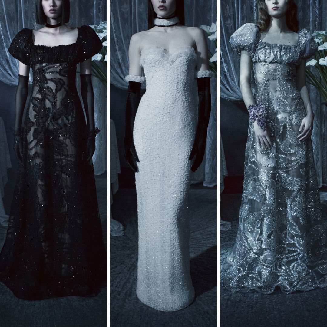
Consider, for example, the collection’s intricate use of sequined crochet. One of the standout pieces, a strapless column gown, incorporated densely crocheted sequins throughout. Such an approach highlights the meticulous craftsmanship necessary to control tension and density in hand-crocheted sequin work. The muted colour prevented this garment from appearing overly decorative or showy, instead emphasizing craftsmanship and technique.
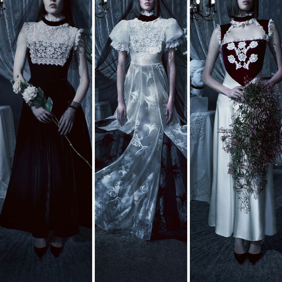
Another clear example was Rodarte’s consistent use of lace appliqué. Garments featuring white lace overlay on darker fabrics leveraged subtle colour contrasts rather than stark ones. Lace elements appeared sculptural rather than merely ornamental, allowing the viewer to appreciate each carefully placed appliqué and the design logic behind it.
Similarly, Rodarte employed glitter and feather embellishments strategically. Rather than using glitter to create a flashy or overtly glamorous effect, glitter was subtly applied to add a delicate luminescence. Feathers matched base garment colours closely, reinforcing texture and movement without creating visual distraction.
This careful attention to detail reinforces why colour subtlety is so effective in textile design: it allows embellishment and surface texture to hold attention. It’s an approach that speaks clearly to any textile artist or designer who prioritizes skillful technique and tactile materials over bright palettes or immediate visual impact.
The Instagram Paradox: Muted but Highly Shareable
While Rodarte’s palette is undoubtedly subtle, it would be inaccurate to suggest that it lacks Instagram appeal. The collection was presented in a dramatically staged, highly atmospheric manner—each look captured with dramatic lighting and romantic styling. Such presentation clearly maximizes visual appeal and shareability online.
In fact, the collection's quiet palette benefits strongly from careful photographic presentation. Muted tones read beautifully under carefully controlled lighting conditions, ensuring that subtle details—lace texture, sequin placement, feather softness — are enhanced, not lost. Rodarte’s collection underscores that muted colours need not be a barrier to digital visibility; instead, they offer opportunities for thoughtful, evocative image-making that communicates depth and craft effectively.
Implications for Textile and Embroidery Artists
Rodarte’s Fall 2025 approach offers clear, practical lessons for embroidery and textile design:
Muted palettes can highlight craftsmanship more clearly than bright, competing colours.
Textural and material decisions become crucial in subtle colour schemes; precision in embroidery or embellishment is amplified.
Subtlety does not reduce visual appeal online—it invites thoughtful, high-quality photographic presentation.
Designers should carefully consider the relationship between texture and colour, as quiet hues shift the viewer’s attention towards detailed craft rather than superficial visual excitement.
Rodarte’s Fall 2025 palette shows precisely how intentional subtlety in colour choices supports—and does not undermine—creative expression in textile work. It is a practical, relevant example for designers and textile artists demonstrating that colour restraint can powerfully highlight meticulous craft and detailed texture.
In short, Rodarte’s “moonlight” palette offers more than poetic imagery—it provides concrete insight into how designers can strategically use subtlety to reinforce technique, texture, and careful craftsmanship, both in-person and in digital presentations.
Written By
Ksenia Semirova
MA Textiles
An experienced hand embroidery and textile artist based in Hove, UK. Professionally practicing since 2021, mastering various techniques.
Also a fine artist and visual researcher, exhibiting her works across the UK and internationally.
Join my mailing list
Get the latest and greatest updates to your inbox!