Black & Yellow in Fashion: A Colour Combination People Fear, Yet Designers Never Abandon
New to Luneville embroidery?
Start with the chain stitch—my free visual guide shows you exactly how
Black and yellow draws attention faster than almost any other palette — which may explain why many people hesitate to wear it. The contrast is extreme: yellow pushes forward, black recedes, and the result is visually loud even when the garment itself is simple. Yet fashion keeps returning to it. Every decade, runways present another round of black-and-yellow looks, ranging from tailoring to eveningwear, while everyday wardrobes remain cautious.
The industry treats the palette as versatile. Most people treat it as a warning sign.
This disconnect — between fashion’s confidence and real-life hesitation — is exactly what makes the combination worth examining today.
A Palette With History: When Black and Yellow Signalled Luxury
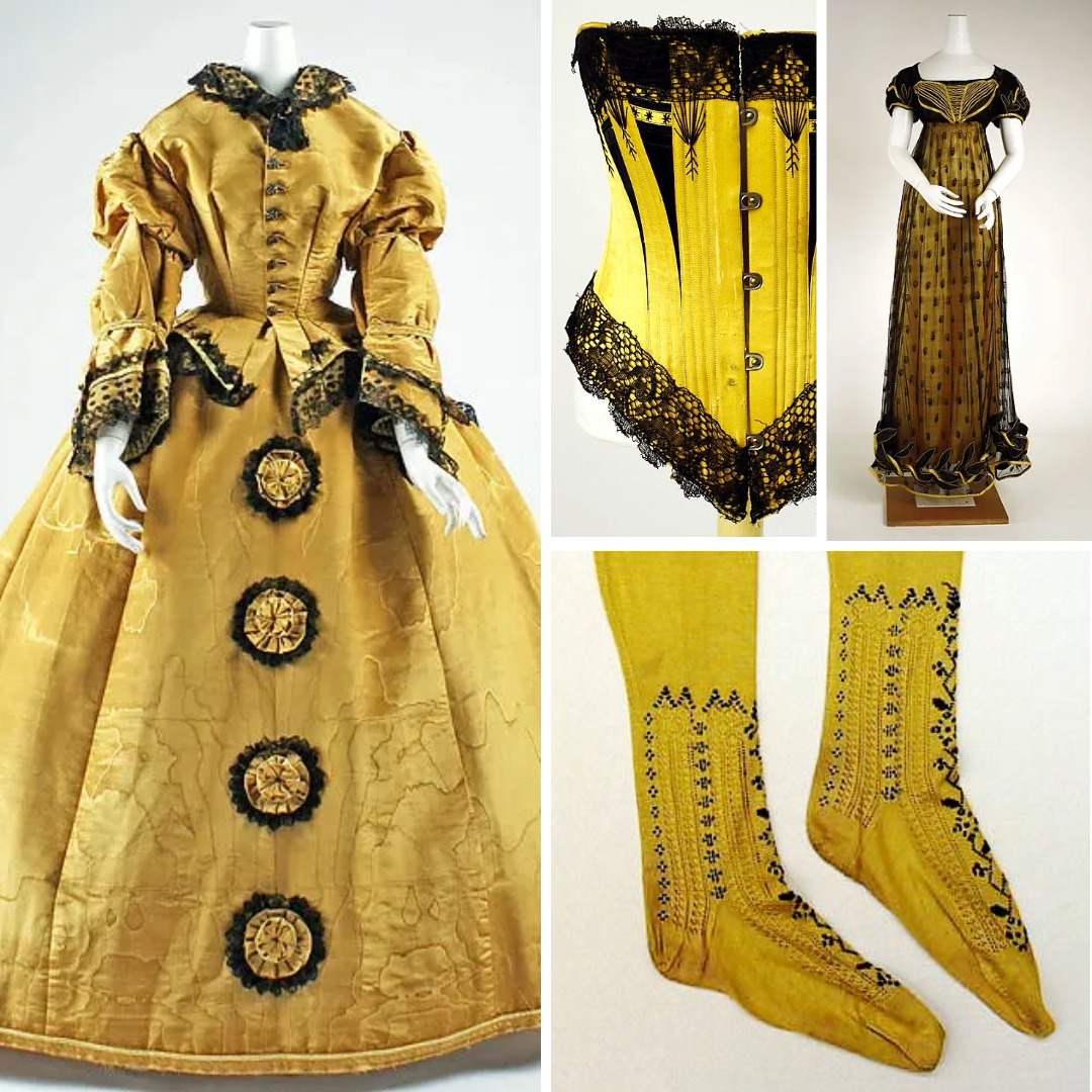
The intensity of this pairing isn’t a modern invention. In 18th- and 19th-century dress, yellow silks combined with black fabrics appeared in formal garments. Black created depth and weight; yellow added warmth and visibility long before electric colour existed. Victorian examples continue the pattern: yellow dresses trimmed with black or corsets combining the two for clear contouring.
Historical embellishment also plays a role. Nineteenth-century beetle-wing embroidery often appeared on black grounds, where warm reflective tones shifted against a dark base. The visual logic — dark depth plus a vivid highlight — mirrors the behaviour of black and yellow today. Designers have relied on this type of contrast for centuries.
2000: The Combination Returns to Pop Culture
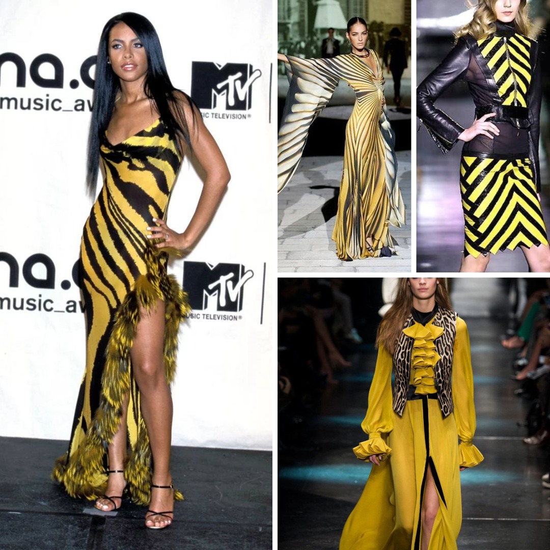
The turn of the millennium solidified black and yellow as a recognisable, high-impact palette. Roberto Cavalli’s A/W 2000 yellow-and-black striped dress, worn by Aaliyah and later revived in the 2020s, is one of the clearest examples. The dress isn’t subtle, and it wasn’t meant to be. Its strength comes from embracing contrast rather than softening it.
This moment matters because it shows a pattern that continues today:
when designers choose this palette, they don’t dilute it — they commit to it.
2010s: Designers Explore Softer Fabrics, Same Contrast
In the early 2010s, the palette reappeared with different materials and silhouettes. Lanvin used yellow-and-black combinations in silk charmeuse — fluid rather than graphic. The contrast stayed, but the mood changed. The garments proved that black and yellow doesn’t have to read as aggressive or costume-like. Fabric choice, reflectiveness, and drape can completely shift how the palette is perceived.
This decade showed that the palette’s reputation depends less on colour theory and more on material behaviour.
2024–2025: Butter Yellow and the New Wave of Wearable Contrast
The latest revival appears through butter yellow. Multiple runway reviews note how pairing soft yellow with black creates a grounded, confident look instead of a sharp, high-intensity one. This is the first substantial shift toward soft contrast within this pairing.
Across 2024–2025 collections, black anchors the palette while butter yellow introduces warmth. Editorial styling picked up the idea quickly: butter yellow coats with black skirts, yellow dresses with black bows, and pale yellows offset by darker accessories.
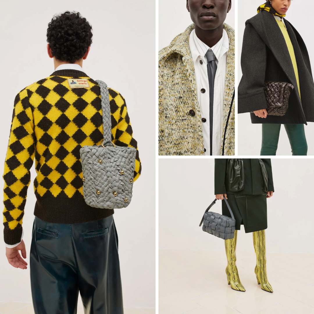
At the other end of the spectrum sits Bottega Veneta’s Resort 2024 black-and-yellow woven set — unapologetically bold, yet texturally complex. These two approaches show why the palette survives: it adapts.
Why People Still Fear Wearing It
Even with all these references, many people consider black and yellow “too much.”
Part of this comes from cultural associations: warning signs, hazard stripes, bees, high-visibility clothing. But the deeper reason is visual. The eye can’t ignore this combination. Yellow always dominates; black always supports. There is no subtle negotiation between tones.
Most people prefer palettes where colours blend or share attention.
Black and yellow doesn’t blend — it asserts.
This is exactly why designers return to it, and why wardrobes hesitate.
Ways Designers Make It Wearable
Fashion continues to find approaches that make this palette more approachable:
Tailoring
A yellow piece under a black blazer shifts the palette into confident, work-appropriate territory.
Eveningwear
Yellow embellishment on black grounds creates definition without overwhelming the garment. It’s an effective way to highlight technique.
Introducing a Third Colour
Adding pink softens the palette immediately.
Black + yellow = bold
Black + yellow + pink = bold with playfulness
This shift breaks the “hazard” association and makes the palette easier to wear.
Using Texture to Control Intensity
Matte black velvet with yellow appliqué behaves differently from black chiffon with yellow sequins. Designers use texture to adjust temperature and soften contrast.
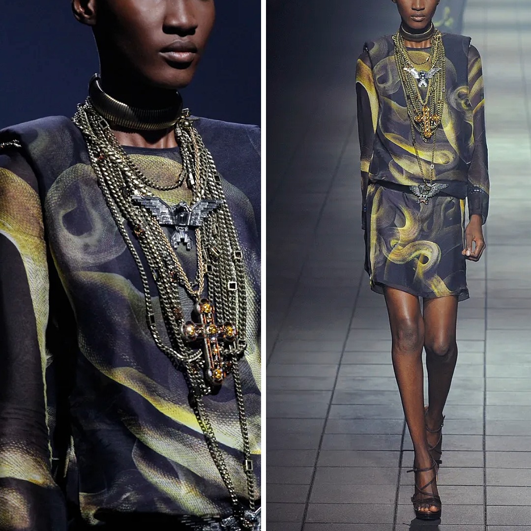
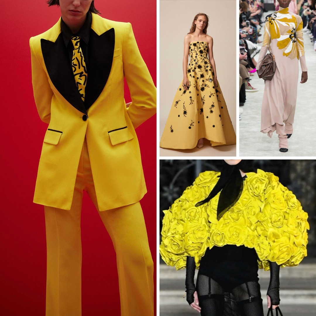
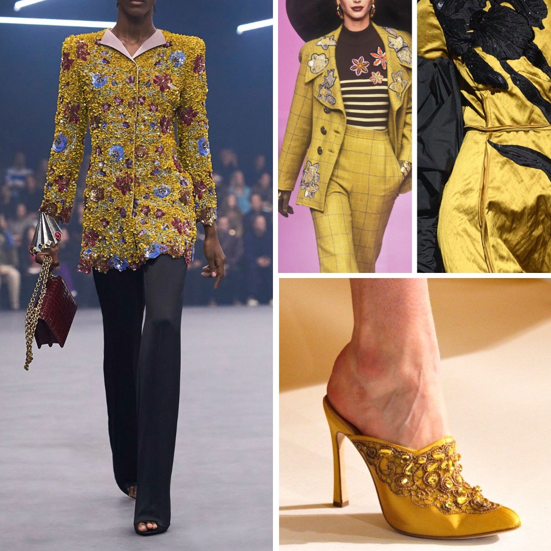
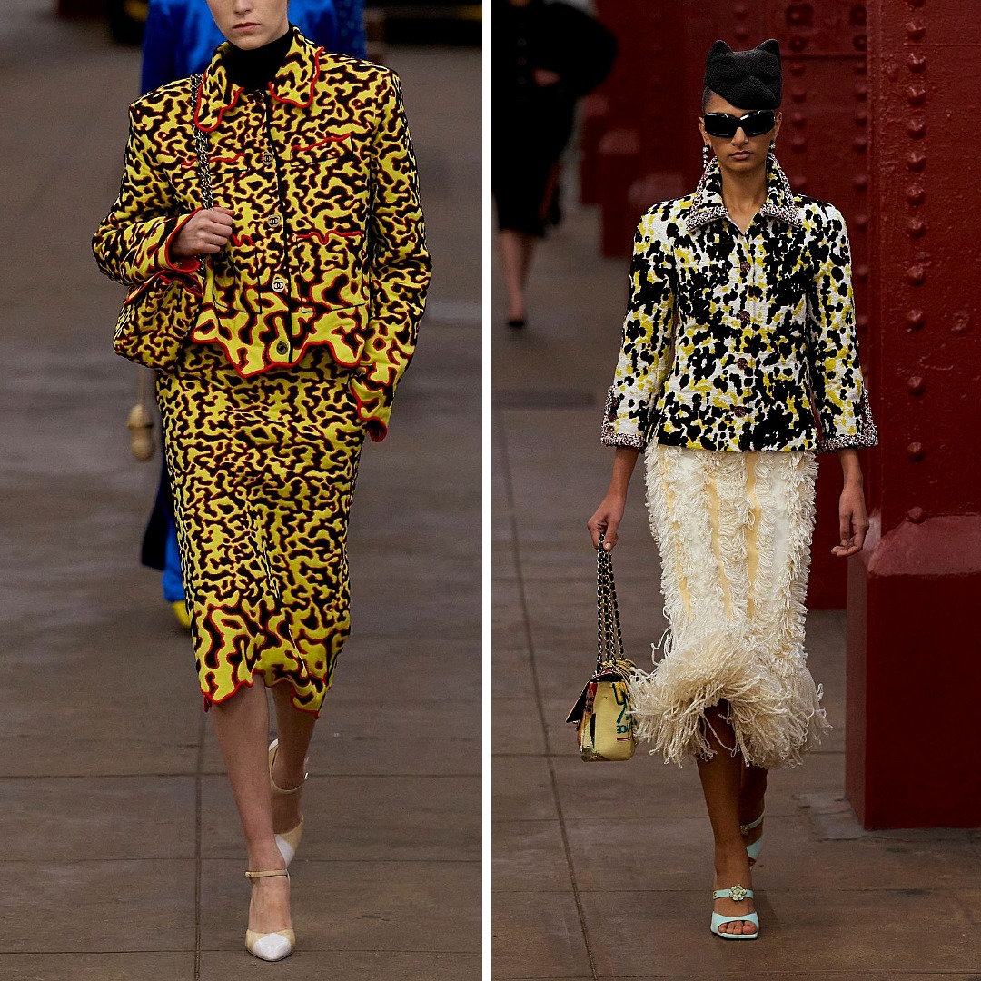
Visual References Across Decades
Black and yellow has appeared in so many eras that looking at it chronologically reveals how flexible the palette truly is. I’ve collected examples from couture, ready-to-wear, pop culture, editorial styling, and streetwear in a dedicated Pinterest board. The range shows how dramatically the pairing changes depending on proportion, fabric, and placement.
Pinterest board: Black and Yellow Aesthetics
What Black and Yellow Reveal About Embellishment
For embellishers, this palette is especially instructive.
High Visibility: On a black ground, yellow stitches or beads read clearly at almost any distance.
Material Sensitivity: Yellow is a demanding colour. Transparent beads may lose definition; opaque beads may look flat; metallic gold behaves differently again. Against black, these differences are amplified.
Optical Depth: Black absorbs light; yellow reflects it. This creates natural depth without relying on heavy construction.
Photography: The palette photographs unusually well: detail stays intact even under soft lighting, which makes it useful for editorial work.
A Practical Example: Gladiolus and Contemporary Contrast
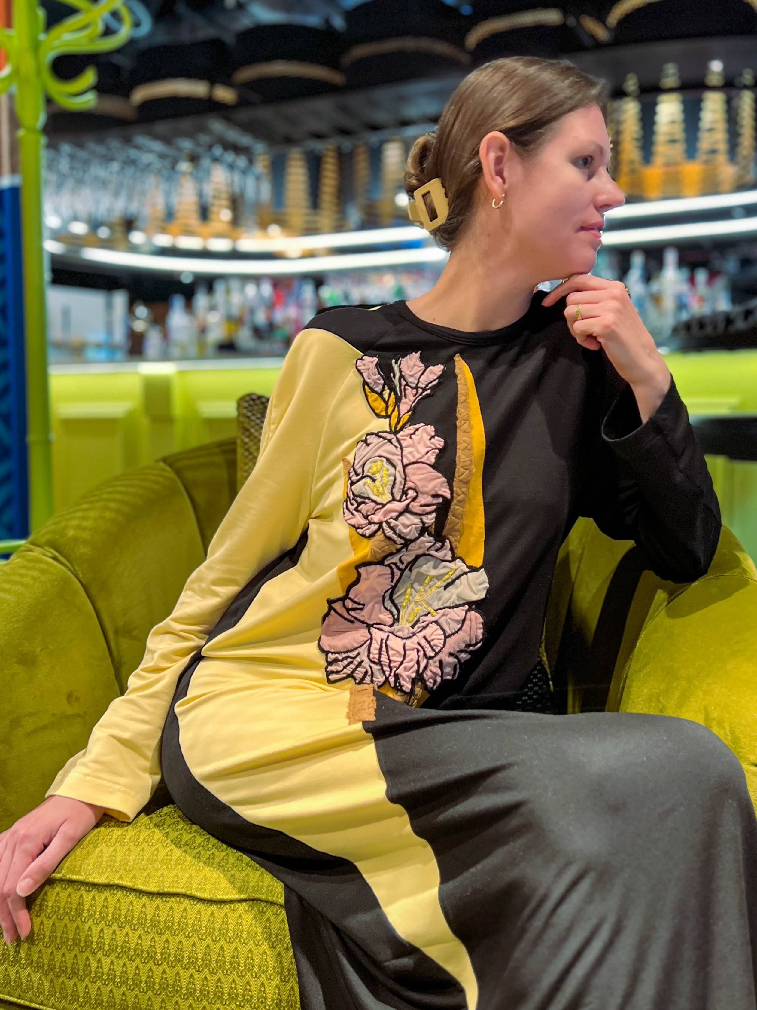
Contrast plays a central role in my own work as well.
The Gladiolus composition — a floral motif applied to dresses and sweatshirts — relies on colour blocking to shift the visual flow of the garment. It’s not black and yellow, but the interaction is similar: a light element against a dark base that immediately draws attention.
This project became a reference point for exploring how placement, shape, and scale affect visibility on garments. For anyone interested in trying a similar approach in their own practice, the Gladiolus course walks through the entire process, from designing the motif to applying it onto finished clothing.
Black & Yellow in 2026 and Beyond
This palette will continue to return because it solves a visual problem designers care about: how to create clear, immediate impact without relying on complicated construction. As fashion’s interest in softened yellows grows, black will remain a natural anchor. As embellishers experiment with transparency, layering, and placement, the palette will change again — not disappearing, just evolving.
People may continue to hesitate wearing black and yellow. Designers will continue using it.
Some palettes survive because they are easy.
This one survives because it refuses to be ignored.
Written By
Ksenia Semirova
MA Textiles
An experienced hand embroidery and textile artist based in Hove, UK. Professionally practicing since 2021, mastering various techniques.
Also a fine artist and visual researcher, exhibiting her works across the UK and internationally.
Join my mailing list
Get the latest and greatest updates to your inbox!